
What I know is all about composition. It's still trial and error for me to fiddle around with my camera's settings. You won't learn anything about aperture and shutter speed from me! So here's our first lesson in composition:
Rule of Thirds
Probably the most important thing you'll ever learn about composition is the rule of thirds. If you use a digital camera it is likely you even have a setting you can use to help you out with this. Look at your camera and see if it has a display button. Mine actually says "DISP". If you have this button, turn on your camera and point it at something, then press the button a few times. One of the displays you may see contains a bunch of intersecting lines. Your viewfinder will look like this:
 Even if your camera doesn't have this setting, it's fairly easy to imagine the lines while you're shooting as well. These lines are to assist you in taking pictures according to the rule of thirds.
What is the rule of thirds? Well, the rule is based on the fact that when a person's eye looks at a photo, it more naturally tends toward the places those lines intersect rather than the middle of the photos. It will notice those four areas, as well as along the lines in the photo, first. So whatever is there will be the most noticeable to the person viewing the photo. What does this mean to the photographer? It means that it's important to position the objects you're trying to photograph in those places, rather than the direct middle of the frame. If you look again at the above photo you can see I've done just that. Mary is positioned along the left line, not directly in the middle of the photo. And her face is positioned right at an intersecting area.
Contrast that picture to this one:
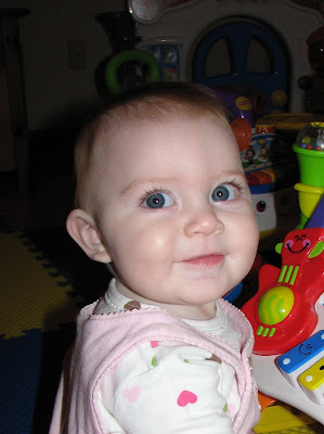
In that photo, Mary's head appears almost directly in the center of the photo. This is called the bullseye effect that a lot of people mistakenly do when they're photographing something. See all that empty space above her head? It's way too noticeable. As the photographer who captured this image, it's not my intention to draw people's attention to the area above Mary's head. And that top imaginary line runs right through the top of her forehead, and that's what will be most noticeable to someone viewing it.
This rule definitely applies to photographing horizons. In this first photo you can see how I positioned the sky to take up about 1/3 of the picture and the land and water at about 2/3. Also, the leftmost tip of land ends at right about an intersecting line.

Here's the same photo cropped in a different, less appealing way. The sky takes up 1/2 of the photo, and there is absolutely nothing of interest placed in any of the areas your eye is most likely to go. This photo does nothing to really display the shoreline, the land, or the water. A photo like this causes me to wonder what the photographer was really even trying to capture.

By the way, not following the rule of thirds when you take the picture doesn't mean you can't crop it that way later on. A lot of times I fiddle around with the picture later on to get the most important objects positioned where I want them. And with a fast moving toddler this is a necessity, because he's pretty much never in the shot how I'd like him!
The thing about rules is, some of them are meant to be broken! The rule of thirds definitely applies in MANY pictures but possibly not in EVERY picture. And you may already be doing this rule naturally, because what looks appealing to someone viewing a photo will probably look appealing to you. Experiment with your pictures using the rule and see what you think.
That concludes our first lesson! :)

Wow, thanks for the explanation! This is definitely something that I *should* have looked up a long time ago. You can definitely see the difference in your example pics! :)
ReplyDeletevery interesting! Thanks Lizzy!
ReplyDelete